brand mark and variations
business cards, 3.5″ x 2″, 16pt. card stock, CMYK + Spot Varnish, full bleed
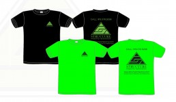
two color screen printed t shirt design, safety green on black shirt and black on safety green shirt.
I discussed this with the client and as a cost cutting measure the t-shirts would not use the branded PMS color and go with safety green as an alternative.
Structure Masonry & Restoration | branding
I developed the branding for Structure with simplicity in mind. An “S” is always a fun letter to work with, so I decided to approach this with typography in mind. To balance the modern look of the “S” inspored brand mark, I used a seriffed type face for the word mark. Seriffed typography was not a popular choice when I made this in 2014, but it made sense for the brand and will outlast a trend.
ClientStructure Masonry & RestorationLinkwww.facebook.com


